


This is by no means a comprehensive guide about HTML. It is more like a Cheatsheet for the HTML Tags that can be used on the various Hive Blockchain Blogging Frontends, what we can do with them, and the classes that can be used to format posts to give them some styling.
Different Frontends will show things differently, and some things may not work at all on some Frontends. However, I tried to only include what works on most Frontends to avoid any troubles in your posts.

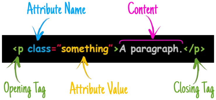
Every piece of HTML (Hypertext Markup Language) will consist of an Opening Tag and a Closing Tag (except very few Tags which are their own closing Tags). These tags are like wrappers, and the whole thing is called an Element, The Tag and its Attribute would apply an effect to the Content that goes in between those wrappers, depending on what Tag we use, what attribute, and what value we set for it.
So, without any further ado, let's have a quick run down of some HTML formatting!
Headers | Styling |
|---|---|
<h1> Header 1 </h1> |
|
<h2> Header 2 </h2> |
|
<h3> Header 3 </h3> |
|
<h4> Header 4 </h4> |
|
<h5> Header 5 </h5> |
|
<h6> Header 6 </h6> |
Tag | Effect |
|---|---|
<blockquote> This text is blockquoted </blockquote> |
This text is blockquoted |
<code> This text is Code formatted </code> |
This text is Code formatted |
<pre> This text is Preformatted </pre> |
This text is Preformatted |
<q> This text is Quoted </q> |
This text is Quoted |
<center> This text is Centered </center> |
|
This is a<br>Line Break |
This is a Line Break |
This is a <hr> Horizontal Ruler |
This is a Horizontal Ruler |
<div>...</div> |
This is a Division Tag. This tag can wrap sections of your post, it will commonly be used with a Class that defines some properties for that section. |
<div class="text-justify">...</div> |
For example, this text will be justified. Giving the paragraph a cleaner and more professional look. |
<div class="phishy">...</div> |
This class, will make any text inside that Div Red colored. Currently this is the only option for coloring a text, and there are no other colors. |
<div class="pull-left">...</div> |
This class, will cause anything inside that Division to be pulled to the left. |
<div class="pull-right">...</div> |
This class, will cause anything inside that Division to be pulled to the right. |

 |
|---|
<a href="Your Link">Your Text</a>
|
To create a hyper link we use the <a href="Your Link">Your Text</a> Tag, replacing the "Your Link" between the quotes with the actual link, and "Your Text" with any text you'd like to show up.
For example, if I am linking to my profile I would use:
<a href="/@yaziris">Hive is Cool</a>
And it would show up like this: Hive is Cool
|
<a href="Your Link" target="_blank">Your Text</a> |
Usually, clicking a hyperlink would take you to that link on the same browser tab.
Utilizing the target="_blank" attribute and value in the tag would cause that link to open in a new browser tab when clicked. |
<a href="Your Link" target="_self">Your Text</a> |
This value of the "target" attribute can be used to in-post link to stuff on the same page. You can for example create an index in your post with links at the top, and clicking those links would make the page scroll down or up to a specified section in your post. I will not go into details about it though, because it currently only works on Peakd, and because there's a detailed guide on how to set it up If you want to learn about it, I highly recommend this awesome guide by The Dude @mondoshawan. |
 |
|---|
| Images are cool, and any blog post would look dull without them. By default, any image you use will take up its full width from left to right. Usually it's a good idea to center them. |
 |
|
The code for inserting an image is: Sourcing your images is always a good thing, you could do this in different ways, one of which, is placing the sourcing directly below the image. |
|
Image by Matryx from Pixabay. |
|
The code for the above image with the sourcing is: We can also make a hyper-linked image, that is an image which opens a link when clicked, by wrapping the <img> tag with a hyperlink one.
|
 |
|
The code to create a hyper-linked image as above is: |
 "
"Image Placement | |||||||||||||||||||||||||||||||||||||||||||||||||||||||||
|---|---|---|---|---|---|---|---|---|---|---|---|---|---|---|---|---|---|---|---|---|---|---|---|---|---|---|---|---|---|---|---|---|---|---|---|---|---|---|---|---|---|---|---|---|---|---|---|---|---|---|---|---|---|---|---|---|---|
|
One of the cool things that are essential for blog posts to make them more appealing is the use of images. Usually an image would take the full width of the screen unless we control that by changing its width using some image editor. However, we can also manipulate the placement of the image relative to the text to an extent, by pulling the image to the right or to the left of the text. | |||||||||||||||||||||||||||||||||||||||||||||||||||||||||
 👈 This image for example is pulled to the left of this text. |
|||||||||||||||||||||||||||||||||||||||||||||||||||||||||
|
This is the code I used for that one: | |||||||||||||||||||||||||||||||||||||||||||||||||||||||||
 While this image will be pulled to the right. 👉 |
|||||||||||||||||||||||||||||||||||||||||||||||||||||||||
|
This is the code for this one: The only difference between them is the class of the <div> tag. One is "pull-left" while the other is "pull-right" respectively.
One more thing worth noting when using image alignments, is when the paragraph you want placed next to the image isn't long enough, and you want to start another paragraph below it. The only way I'm aware of currently to do that is by using an <hr> tag.
|
Vertical Dividers |
|---|
|
Creating horizontal dividers to divide sections in your post is cool and all. However, we can also make vertical ones, utilizing the "pull-left" and "pull-right" <div> class we mentioned above.You may simply flip a horizontal divider image vertically or create one, the only catch is you'll have to mind the length of it so it can align well with the text you are placing in-between the vertical images. Also, Do Not use an <hr> tag. It will break it :(
|
|
The code for achieving the above is:
Any text that goes below that code will be placed in the middle between the two vertical dividers, provided the image width allows it and the length is sufficient. |
| This might be useful for bilingual posts. As some people prefer to have one language on each side. A divider can be placed in the middle between the two languages. |
  Some paragraph to the left with some language. Algún otro párrafo a la derecha con otro lenguaje. |
|
The Vertical Dividers in the middle can be achieved with the following code:
I used two dividers to do that, because if I use just one, it will be very hard to center it without something breaking depending on what device it is viewed on. So, this is a workaround for that issue of a vertical image being off-centered. This is how it will look like if I use one divider and center it instead: |
|
Some paragraph to the left with some language. Algún otro párrafo a la derecha con otro lenguaje. |
It will look alright but a little off-centered on wider viewing devices. However, it will break and slip below the text on smaller viewing screens.
But here's the code for that just in case:<div class="pull-left">Text to the left with some language.</div>
<div class="pull-right">Text to the right with some other language.</div>
<center><img src="Image Link"></center>
We do have another option for doing that though, a better one in my opinion, where we can use one divider. Through the use of Tables! |
 |
|---|
| A Table in HTML consists of multiple tags, Tables are powerful and useful, although they can be a bit confusing at first. So, let's try to simplify it. |
<table>...</table> |
This is the main Tag to construct a Table, it will be the wrapper around all of the rows and data inside our table. All the other Tags listed below will go inside this main table tag. |
<caption>...</caption> |
This is optional. You can give the table a Title when using it, which will be placed above the whole table. |
<th>...</th> |
This is optional too. It can be used to make headers in the first row of the table, like a title for each column. |
<tr>...</tr> |
This is one of the key Tags in a table. It will define a row in the table, and everything between its opening and closing tags will be on the same row. |
<td>...</td> |
This is the wrapper tag for the data that will be placed in the table, each "cell" of every row in the table needs to be wrapped with it. |
| Let's construct a table that has 2 rows with 4 cells in each row for example. (1 extra row for the columns' headers) |
|---|
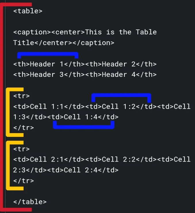
As you can see, everything is wrapped with the <table> tag, each row we define is wrapped with the <tr> tag, and then each cell data in each row is wrapped with a <td> tag.
<table><caption><center>This is the Table Title</center></caption>
<th>Header 1</th><th>Header 2</th><th>Header 3</th><th>Header 4</th>
<tr>
<td>Cell 1:1</td><td>Cell 1:2</td><td>Cell 1:3</td><td>Cell 1:4</td>
</tr>
<tr>
<td>Cell 2:1</td><td>Cell 2:2</td><td>Cell 2:3</td><td>Cell 2:4</td>
</tr>
</table>
| Header 1 | Header 2 | Header 3 | Header 4 |
|---|---|---|---|
| Cell 1:1 | Cell 1:2 | Cell 1:3 | Cell 1:4 |
| Cell 2:1 | Cell 2:2 | Cell 2:3 | Cell 2:4 |
| Now, going back to the Vertical Divider in the middle of a bilingual post example. We can accomplish it in a cleaner and more precise way using what we learned from Tables. Keep in mind though, the image in the middle might get resized. But that can be easily fixed by placing a couple of before and/or after the image tag.
|
|
Ahora, volviendo al ejemplo del divisor vertical en medio de un post bilingüe. Podemos lograrlo de una manera más limpia y precisa usando lo que aprendimos de las Tablas. Tenga en cuenta, sin embargo, que la imagen en el medio será redimensionada. Pero eso se puede arreglar fácilmente colocando un par de antes y/o después de la etiqueta de la imagen. |
|
This is the code for the above table: The key to adjusting the spacing of the cells and consequently centering the vertical divider is adding a string of non-breaking spaces ( |
| Tables can be a very handy way for formatting. Almost anything can be placed in them, including images. They can give you a bit more control over where your text or images can stay aligned. |

|
 Or below them! Or below them! |
|
| With some paragraph next to it, or maybe none. |
 |
|---|
|
There are 2 types that we can use. One is "Ordered", which shows a number next to each item in the list. The other is "Un-ordered" one which shows a bullet (dot) next to each item instead. |
<ol>...</ol> | This is the wrapper that creates an Ordered List. |
<ul>...</ul> | This is the wrapper that creates an Un-Ordered List. |
<li>...</li> | This is the wrapper of each item in a list which gets placed inside the Ordered or Un-Ordered List Tag. |
|
|
This is an example of an Un-Ordered List nested inside an Ordered one. That code will show as the following:
|
One last thing that is worth mentioning is Why HTML?
Some people find it easier to just use MARKDOWN instead, which I personally don't find it so, but generally speaking, Markdown is much more limited, and you WILL still need HTML tags for many things.
- HTML is more tidy.
- Mixing up HTML and Markdown in your posts can cause troubles and strange behaviour sometimes.
And that's in a nutshell why I prefer to always use only HTML in my posts.
That's it folks! This sums up almost all the HTML TAGS that work on most frontends which you may need to format your posts. I hope you find it useful in your posts, giving them that extra touch of formatting and styling to make them look awesome.
If you have any questions, feel free to ask!

Header Stock images from Pixabay & Pixabay Edited by me.
Images, dividers, and ribbons are created by me, using Picsart App.
The PowerUp Bee in the Honeybee Divider is courtesy of HiveBuzz.
The Terminal Logo & Banner images are courtesy of @theterminal.
© 2022 @yaziris.