For all the projects I undertake, I never compromise on the professionalism of what is delivered. The same goes for the Hive Authentication Services project. That's how I always worked for HiveBuzz, one of the major projects I created on the Hive blockchain.
And this is why I wanted a visual identity for the Hive Authentication Services made by a professional visual designer. I briefed him on the creation of a clear and strong identity oriented towards the digital world.
The material you've seen so far was done "quickly and not too dirty" by myself, as I didn't want to delay the project while waiting for the designer to finish his job.
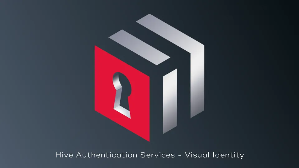
Today, after a long preparation work made of many comings and goings between us, taking advice from outside people, I'm happy to introduce you to the new and now official visual identity of the Hive Authentication Services project.
Design Speaks Better Than Words
That “A picture is worth a thousand words” proverb might have become a cliché, but if you ask the reality, it is so true.
Take Apple’s logo, for example. What do you see on the back of every Apple product: MacBook, Macintosh, iPhone, and iPad, etc.? Just Apple’s logo! You don’t see a mission or vision statement, not even a tagline.
When it comes to spreading the word, the design comes first and then comes the words. The design speaks louder, clear, and better than words.
A Planned Progressive Evolution
However, although we wanted to fully adhere to the philosophy presented above, in view of the feedback received from a large panel, it became obvious to us that we first had to communicate part of our message with our identity.
This is why, in the material that we will make available to developers and people who wish to reuse our identity for their communication, we have provided several variations of it.
To describe them to you, I will proceed in the reverse order of what we have planned for use, i.e. from the simplest to the most descriptive.
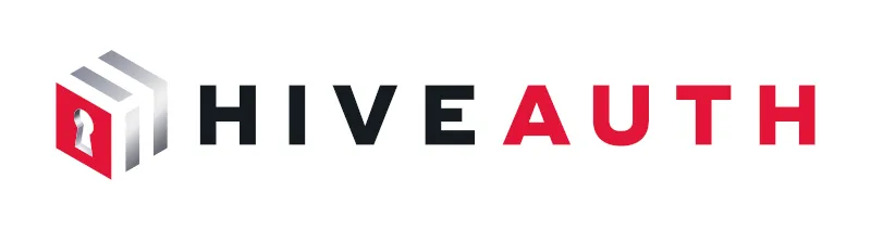
1. The Logo
The HAS project message is "Authentication made easy and secure thanks to the Hive blockchain"
So I asked for a logo that can convey the main concepts of this message in the simplest way possible. Here is the result of our work:
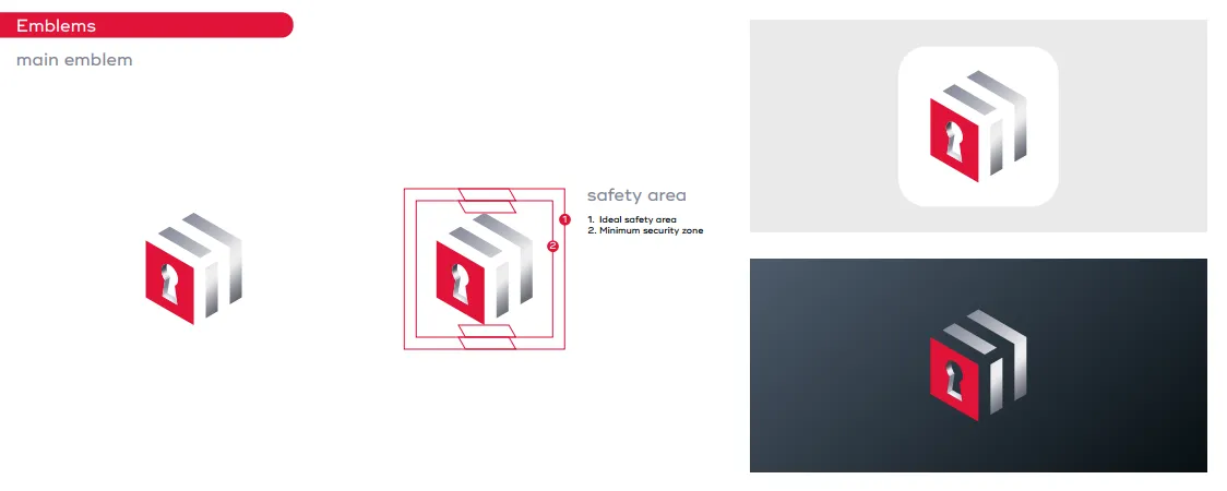
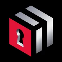
the logo must be readable on dark and light background
I don't think I should be unnecessarily verbose to describe this logo to you. If you can't find in it the ideas mentioned before, then we are in trouble. According to the feedback we received from a large panel, this should not be the case.
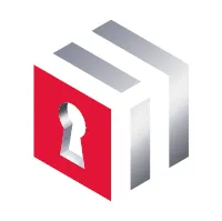
2. The Name
As explained in the introduction, we anticipate an intermediate step before the logo is recognized at first glance by all. This is why we have also created a variation of the logo accompanied by a name (once again provided for dark and light theme):
Here, we are clearly making reference to a process that is already well known to developers and some advanced users: "OAuth".
With such a name, we are clearly targetting app developers because without their adoption to add HAS protocol support within their application we will miss our final target: the users of these applications.
OAuth is an open-standard authorization protocol that allows you to approve one application interacting with another on your behalf.
The purpose of this 2 concatened words name is clear:
- It's about Hive
- It's about Authentication
Two words, two meanings, with contrasting colors to distinguish them clearly.
The icing on the cake: the hiveauth.com domain was available.
3. The Baseline
Of course, we are not only targeting developers and tech-savvy people. At first, we will have to be more explicit about the purpose of the services provided by this innovative solution.
That's why we will also provide our logo with a baseline:
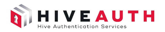
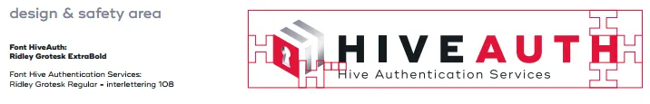
It's here presented with the work done by the designer to make all the elements properly balanced. This process has been applied to all the elements created.
We used a sober baseline, neither abstract nor verbose and easily understandable.
The Button!
Last but not least, this is what I would like to see everywhere, on every app: the Sign In button!
As I explained during my presentation at HiveFest, my dearest wish would be to see this button replace the Google, Twitter, Facebook, ... and other centralized logins with a universal, safe and totally decentralized version:
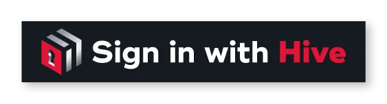
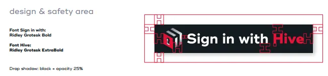
Again, you can see that each element of the button has been placed carefully in the right position to keep the whole visual perfectly balanced.
Material is available for use
Every component of the HAS Visual Identity can be found on the HAS Documentation website.
What is presented here is a small subset of the available items we created and we will add other elements to it, intended not only for developers but also for marketing.
If you plan to use this material, in order to maintain a coherent and consistent image of the project, I urge you not to modify any of their characteristics (colors, font, spacing,...)!
The documentation site provides detailed usage guidelines and as many graphic items as possible in order to simplify your work:
- logos, banners, backgrounds, icons, diagrams ...
- in landscape or portrait format
- in dark or light theme version
If you do not find your heart's desire there, do not hesitate to contact me.
Thanks for reading.
Support the HAS project |
|---|
Vote for the proposal on Ecency vote for the proposal on Hive.blog Vote for the proposal using HiveSigner |
Check out my apps and services