Hi Ragnarok community, how are you today?
This is my entry for the "Ragnarok Logo Contest". I'm into it because I like to explore my creative design skills and for FUN.
About me
I'm a developer and like website development. But I do not consider myself a Designer. My first job required me some photoshop skills and I had a good designer mentor that teach me some tricks all of these tricks help me until today when I need spend some time editing visual stuff, pictures, logos, PowerPoint presentations, and others...
I learned the importance to have a good designer in your team but also know-how is important to brief well the job you want and what you expect. But let him with the creative part and try not to "cut his wings" in creativity.
As this creation process takes a while, go into the modification phase, repeat and approval... I go there and try to create something quick to illustrate the project, letting everyone know that is just an illustration, not official.
First Step
The first step I do when I receive a task like that understand the max possible about it.
So, I read the abstract and any documentation available.
You can read more about Ragnarok here.
That is important. Let's read.
After reading, I have some ideas in my mind. Usually, I ask for 3 different kinds of deliveries. That way, we can see what we like most in all of them and become the easier move to adjustments or who knows, an approval at first. it happens.
The logo can be anything you think is fitting for Ragnarok. The game's base theme is a giant universal...
Brainstorm
I collect all that ideas and make a brainstorm. Something like this:
- realms
- battle
- game
- Vikings
- civilizations
- warriors
- lands
- weapons
- speels
- rebirth
The Concept
After a while, I think that battle is always at our side, from ancient civilizations until now day. Can be in form of war our daily battle with work, friends, people in general in a nonviolent battle.
We need to conquer lands, buildings, have our weapons strategies and intelligence, and a little bit of magic helps a lot, right?
In the end, everyone is going to die battling, and we as warriors believe in rebirth.
I think I have an idea
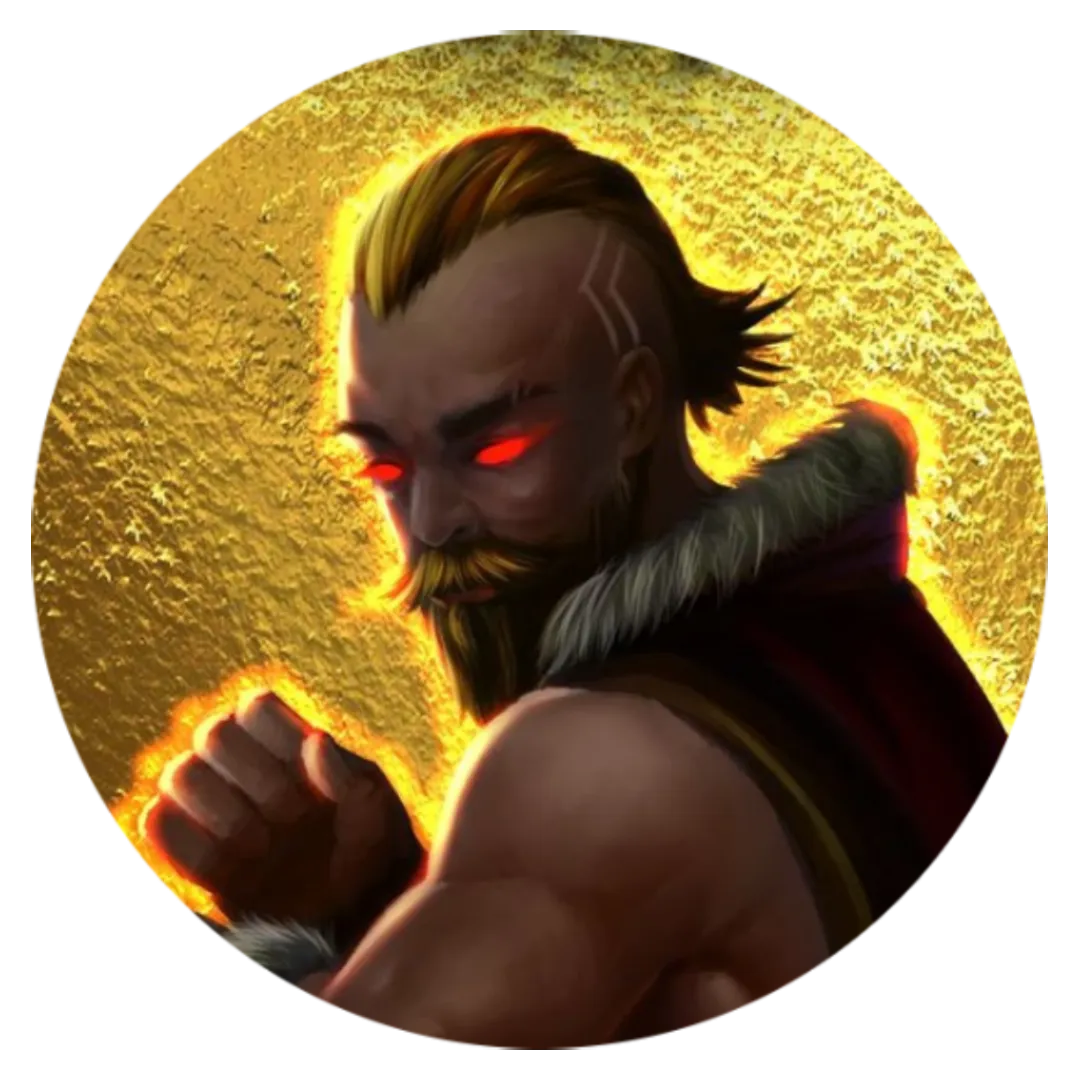
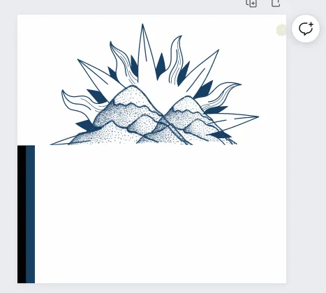
That's the moment after thinking about the subject and what that made me feel I came up with some ideas, in my case, I remember about Valhalla.
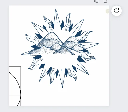
Gates of Valhalla is represented by mountains, and we have mountains in our brainstorm, and also have lands, and speels
How about the logo is mountain terrain representing game lands and a mandala that represents the magic. Maybe some weapons too.
Searching for elements
I like to use open source and free materials. In this case, I used the Canva.com library. If you don't know canva.com I invite you to subscribe here using this reference link: https://www.canva.com/join/jvd-pjn-txl
The other tool that I use is GIMP.
I search for elements that I like and think are a good fit to use.
Remember that I'm trying to build a concept logo than a final version. And maybe it inspires you and others to create something better for a high-level game.
The chosen ones
Start building something
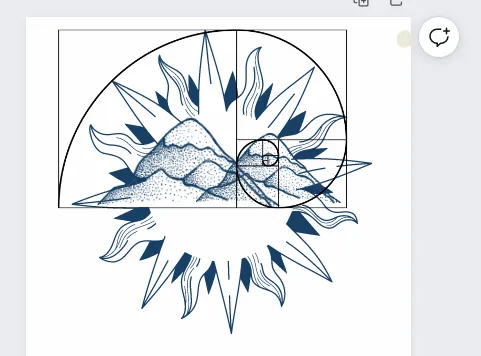
I like to use the golden ratio for reference, if you don't know I recommend you to learn about it. very interesting...
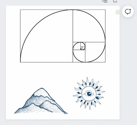
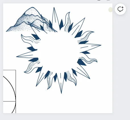
After Organizing and resizing my canvas elements, duplicate the mountains and change their sizes so they look different and give a more natural mountain look and feel.
I also thought about using triangles and giving a minimalist style. Maybe for logo v2.
After alignment and resize, I use the golden ratio to give a final touch and see if it's harmonical.
|  |
|---|---|
 |  |
We need letters

An important part of logo creation is the visual identity of the project or company. Its usually created within the logo, signatures, font used, and others materials that will be used further in the project and give it the same visual identity. For digital or paper communicate and be recognized the same way.
After coming up with the font that will be used, check if it's ok with the logo.
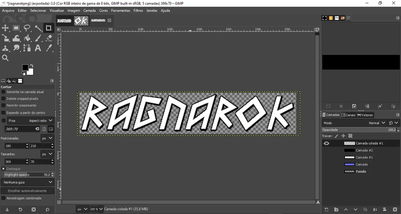
I chose the blue color capturing from project images. Paint the letters with the same logo color and this is the text font final result.
I'm kinda happy with this lettering result and decide to move on.
Merge all
I like to present the logo in light and dark backgrounds, so I build it up with 3 different background colors, black, blue, and white. I the blue one I changed to yellow and red to see if works well too. For some of them, the dark logo will fit better than the light logo.
 | 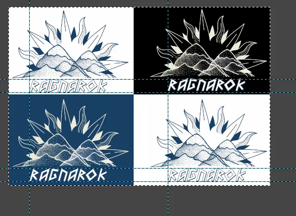 |
After building all versions of it, I transport it to gimp so I can compile one image with all versions and align it for the presentation.
The Logo
That's the final result of my logo concept for the Ragnarok Logo Contest:
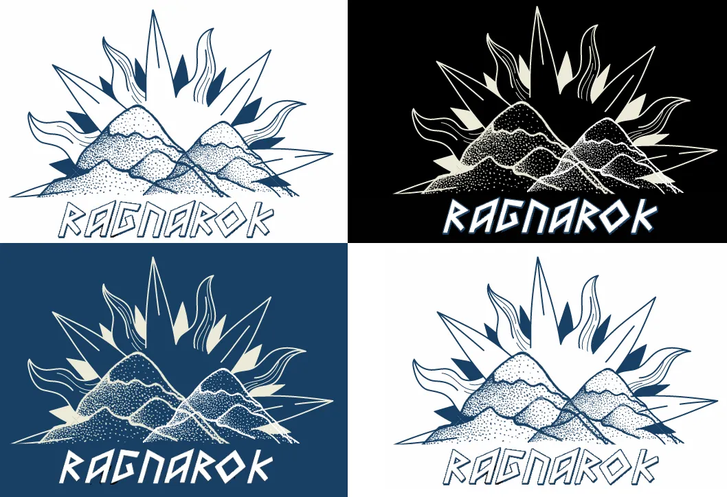
Hope you like it and feel free to modify and make more versions of it. Maybe with a more gamer aesthetic.
See you soon
@vaipraonde

