The Dragonjumper's lore is one of the first ones in the game that made me chuckle. He is a fighter that seems modernistic in an ancient time. I wanted to push the idea further and create a Dragonjumper that would be more fitting in the modern times.

Dragonjumpers are not Dragons themselves. That would be foolish for the Gloridax, with the high rate of failure and death in this particular profession. These soldiers are trained to literally jump off of Dragons’ backs and into battle zones. Thin, leather webbing worn between their limbs slows the fall of the Dragonjumper just enough for them to survive the landing (usually).
-Lore
You see, according to the lore, Dragonjumpers are a wimpy part of the army with a very weak success rate. However, aerial warfare has been historically one of the strongest war tactics. I believe that as time passes, Dragonjumpers would evolve to become one of the most elite assassins in modern splinterlands warfare.
But how?
First of all, the suit would be made as flexible, light, and aerodynamic as possible. The Dragonjumpers are strictly melee fighters, they would have to be strong and buff to fight enemies face to face. Additionally, "useless" features of their suits would be minimalized but still left in the kit as it is part of their identity. Finally, I wanted to take modernism a step further.

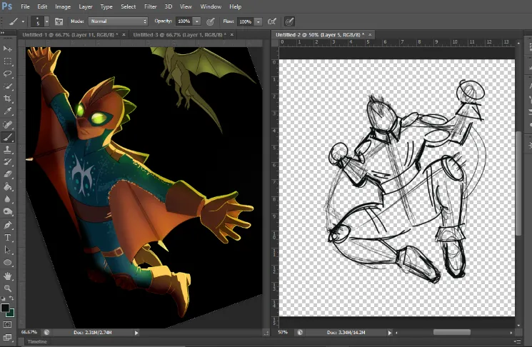
First things first, unlike my past splinterlands art submissions, this one is very different because I did it from scratch. Including the design. In my head, I pictured Batman, spiderman, and hulk in a jumping shot and used some references to get the initial sketch. The pose should be seen from the bottom so at the end he should look much darker since the light source would be behind him.
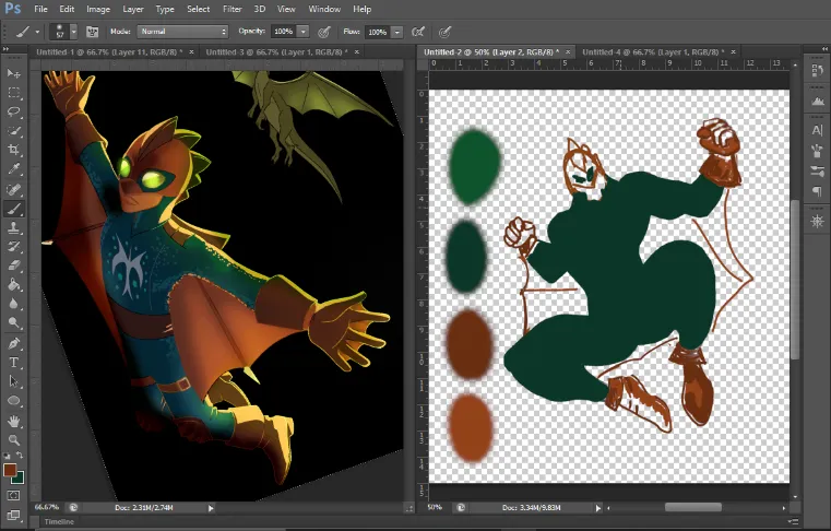
From there, I added the primary colors to the sketch. I am still struggling with painting faces and hands, so I left them as roughly as possible. Closed hands are much easier than open hands for me. Because of this, I had to give up on giving him the signature webbed gloves. However, this has the added benefit of making Dragonslayer more confident and strong.
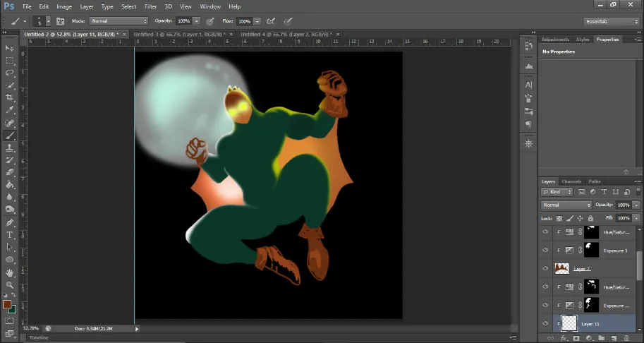
Shading with paint is another part I am still working on. So I eventually decided I would do the shading and 3D effects when I paint in the light sources. Creating depth with exposure and adjustment layers is much easier when I have a good idea of the light sources.
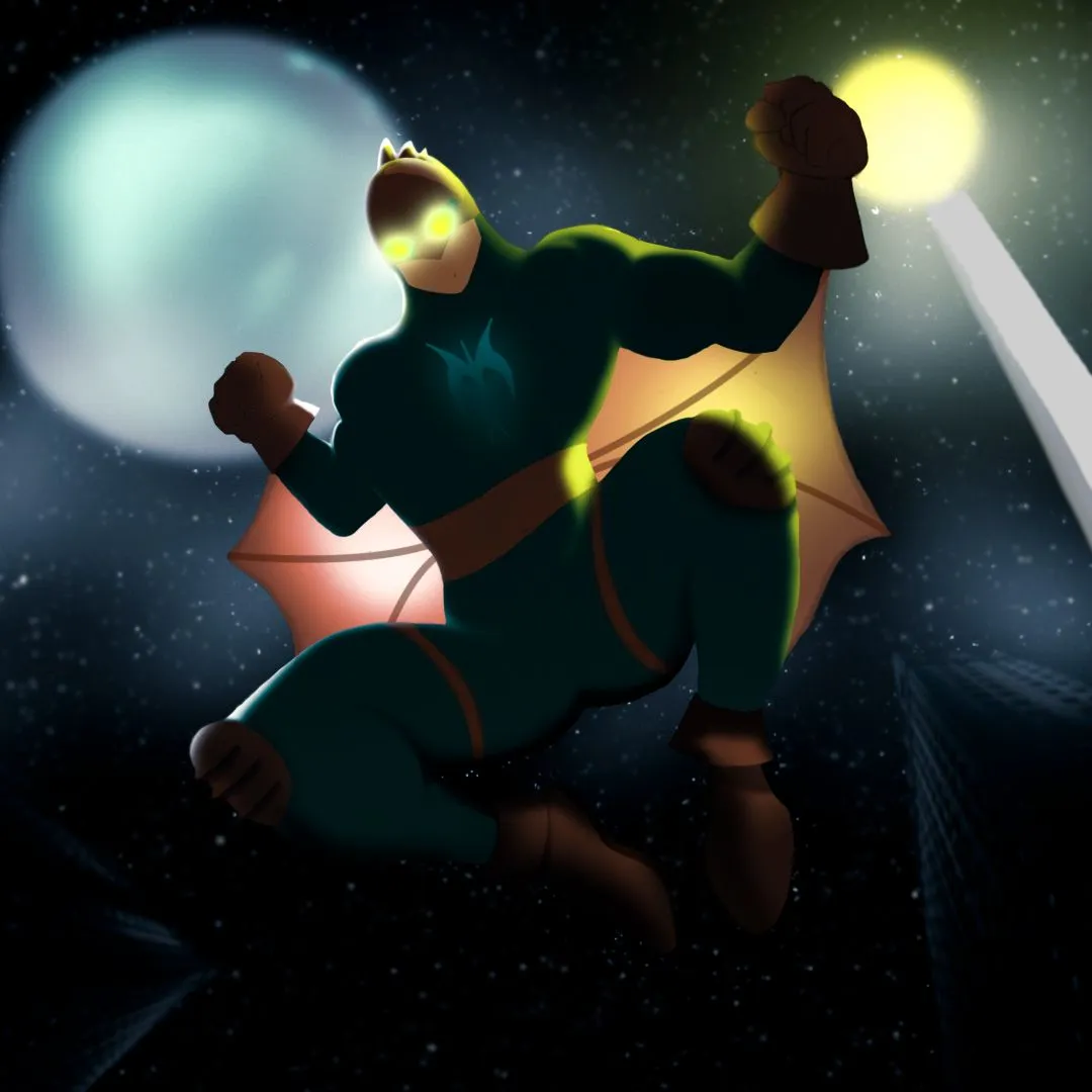
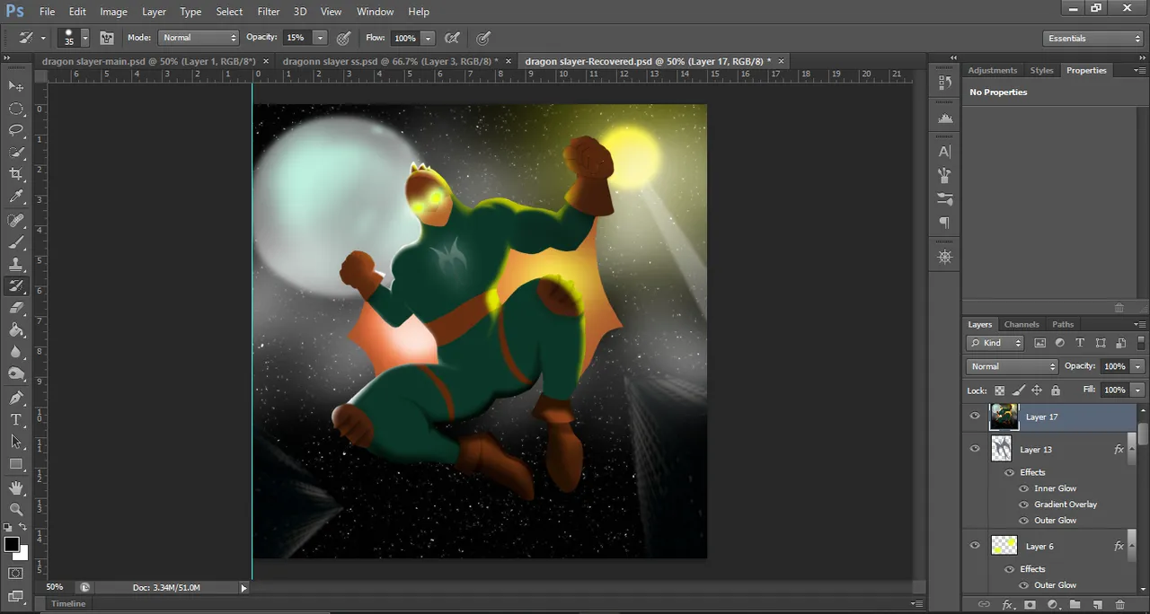
I added a large moon behind him since it would be a very clear indication as to where the Dragonjumper is and which direction is he moving. To keep him as close to the original, I added the thin stretchable wings but in a more relaxed form to create an impression of the height he is in and to show he is ready for action. It kinda makes sense at the end, as you can see in the final render that I have uploaded on top.
Using exposure layers and adjustment masks, I added a white rim to one side of the Dragonjumper. His shiny thin suit would create such a reflection. On the other side, I added a yellow light. These rims of light also give him depth and show off some of his muscles as well as makes him less 2D.
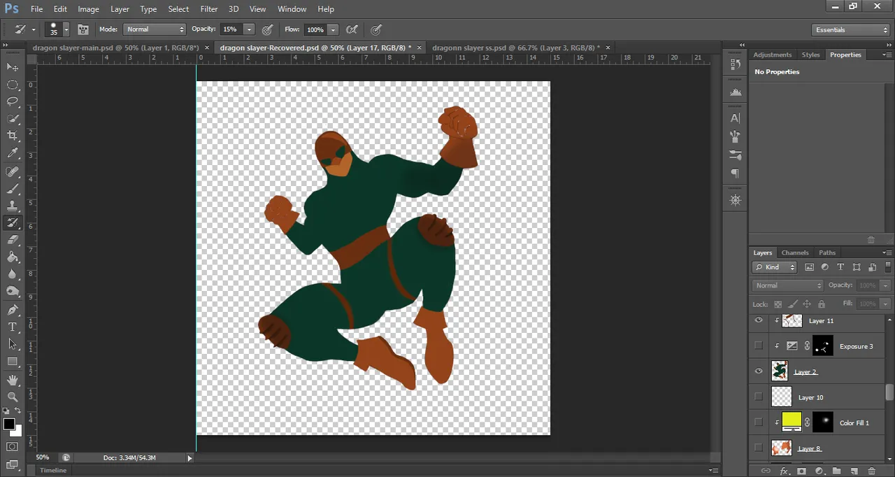
This is what he looked like without all the added extras and with his gloves and shoes filled in. From there I added the wings, and started shading him with the burn brush to give me some sort of a guide without actually distorting too much of him. I am still working on streamlining all this. I have been playing with digital art for only 3 weeks now.
I added yellow glowing eyes since it would make the Dragonjumper so much more hero like. It also adds so much more character to him. In the original, Dragonslayer has a gem-like lens. I could only assume it could also glow.
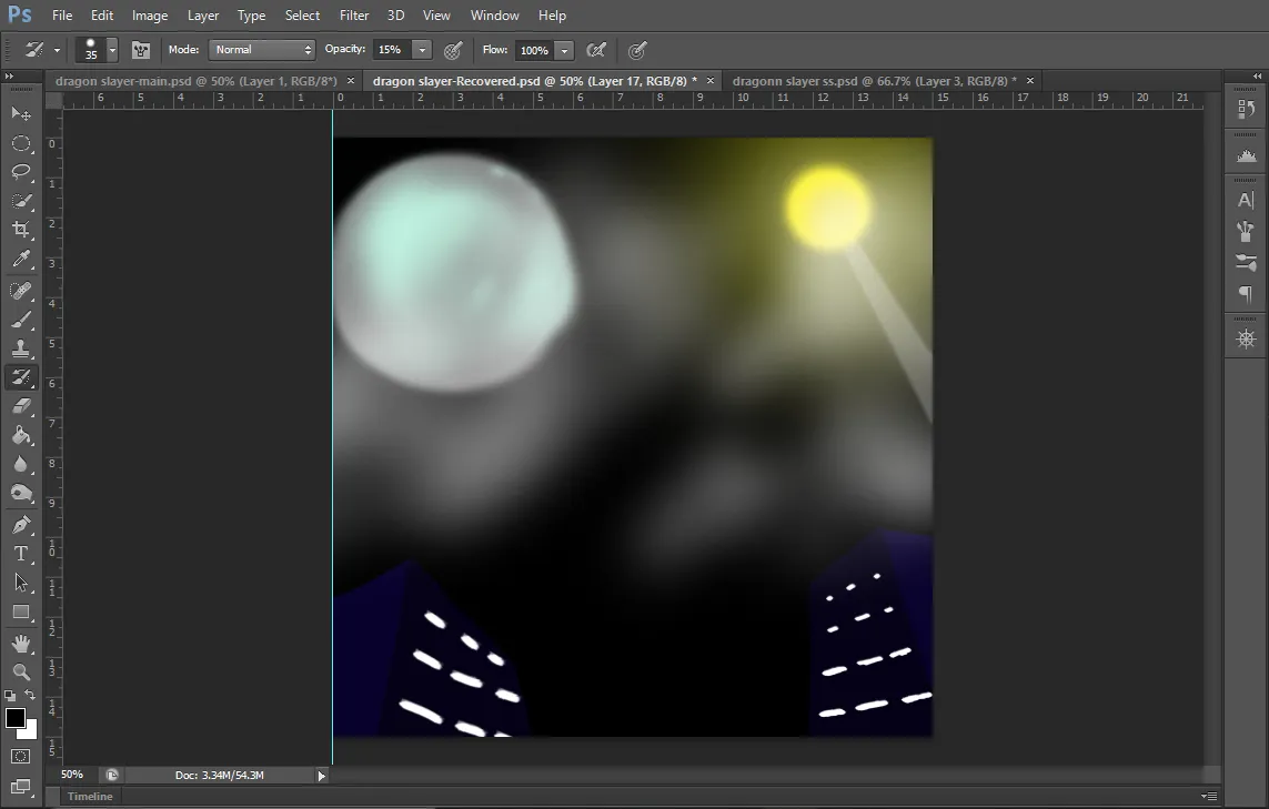
To really sell the effect, I started working on the background. It had to look like the shot is taken from below. So everything should converge towards the top. I blurred the moon and added some soft glow around it. I painted in a lamp post with a bright yellow light and blurred all of it. Then I added some mist (it could be seen as clouds too) using a sold color layer mask and a low flow large soft brush. Then added a yellow glow around the lamp using the same technique. For most of the background elements, I used the tips @japex1226 kindly gave me. It is amazing what a simple blending option can do to the entire layer!
What I thought would be the final step was adding his logo on the chest. I cut it out from the original splinterlands card and placed it on the chest. It took a lot of distortion and warp to make it look just decent. The angles are very different in the card and my artwork.
But he still looked very bright for such an angle. I did some final adjustments and added a few extra particles to really sell the nighttime look. I cleaned up the edges of all the layers and blurred the background articles did some minor tweaks to the subject.
Then, for the first time, I had a successful run at the camera raw filter option!
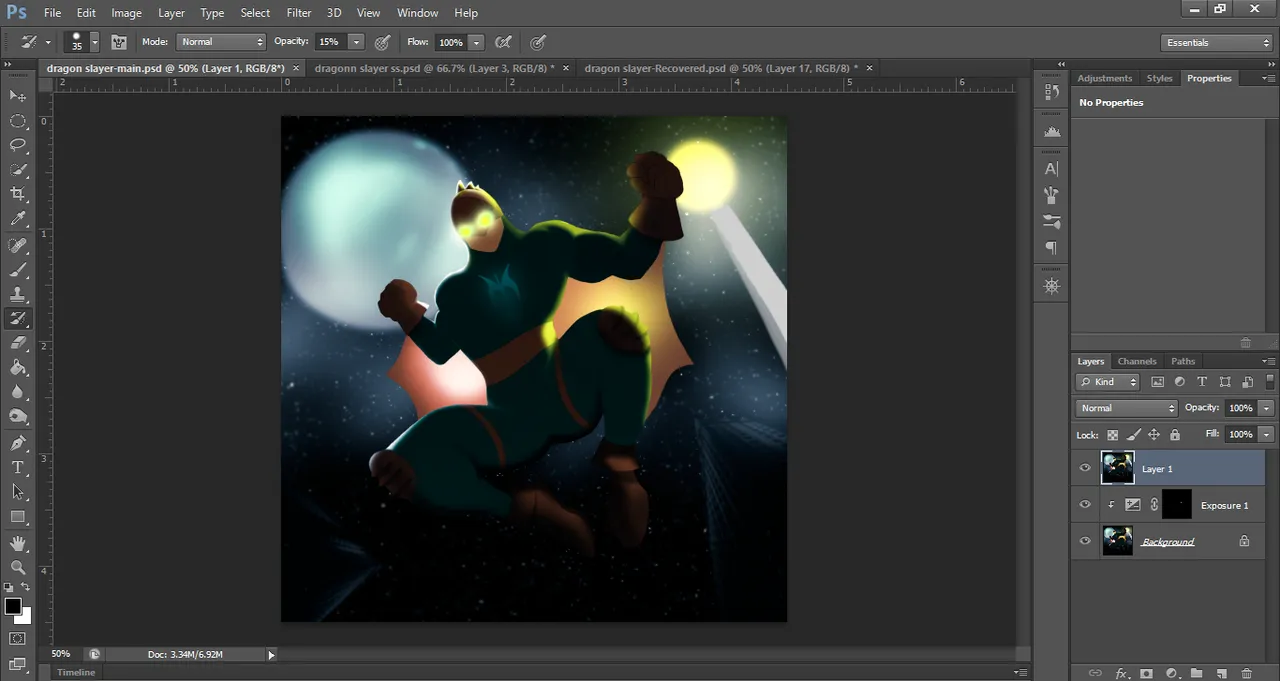
Dark, blueish, and misty. It looks so much better! I never had such success with the camera raw filter option. Yes, it took a lot of trial and error, but I am very happy how it turned out. The highlights look so much more natural. The shadows are smooth. The darkness is very balanced and I haven't lost much detail from either the background or subject.
Look at the shoes, you can almost feel how soft they are. Look at the knee guard under the moon, it feels tangible. The helmet also has a realistic effect! I am working on finding such results in all my work.
Scroll all the way up to see the final image!

Affiliate links
Rising Star
Exode
Huobi
Appics
Splinterlands
Actifit
Binance
Ionomy
Cryptex