Public data appears to confirm that COVID vaccination rates do not correlate to a reduction in deaths. Meanwhile, deaths potentially attributed TO vaccine adverse reactions mount up!
Having studied both the data and politics of vaccinations for 15 years in a private capacity, I am well aware of the way that data is routinely manipulated and obscured in order to give an impression that vaccines achieve more than they really do. This strategy isn't just applied to vaccines, it is standard practice for the large pharmaceutical corporations for most of their products.
While this is a huge problem for the world in general, for some reason it is vaccines, more than the other categories of products that the general public seems to be willing to accept on pure faith and trust - without doing due diligence research themselves. We only need to listen to the arguments set forth by pharma executives and corrupt regulators as to why they never perform proper blind, placebo studies for vaccine products to see how perverse the situation is.. They will say 'oh, performing such studies would be unethical because we already know the vaccines work and are safe'!! This is not science and is highly unethical - yet it has become the norm and has gone mostly unquestioned until relatively recently.
With adverse reactions to the experimental COVID shots being astronomical in all tracking databases - from the US, to the UK, Europe and beyond - questions are finally being asked. None the less, the key data is almost ALWAYS obscured!
Thankfully, there are independent researchers publishing their findings online and via social media - who often receive ridicule from people who have never provided anything of any use to the debate and who usually prove that they are unable to use logic coherently. These people will format data in a truly meaningful way and the result is that we often see a very different picture to that being painted by the controlled narrative, published via mainstream sources that are bought and paid for. (Note: Check out the leaked video of the Australian Editor of the Daily Mail telling journalists to cover up negative data regarding vaccine performance.)
Today I found a very nice collage of data that has been published in a realtime app which analyses various COVID19 statistics. The sources are listed at the top of the app and include:
On page 12 there is a very revealing graph:
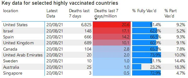
We can clearly see that the 'Deaths in the last 7 days per million of population' for highly vaccinated countries reveals that the level of vaccination is consistently not a highly significant factor in the rate of mortality overall.
In a previous post I dived into the question of whether or not vaccine might actually be increasing the level of deaths, since it is so often the case that levels of death increase shortly after vaccination drives - often to a degree that follows the level of vaccination.
This new graph does not discount that vaccines are driving levels of mortality per se, in that most of these listed nations did the bulk of their vaccine rollout long before the last 7 days.
What we can say, though, is that despite the US and Israel having relatively high levels of vaccination, their level of mortality remains high. Despite Australia having a low vaccination uptake, their level of mortality is very low. There are countries with both high and low vaccination rates which have low mortality and there are countries with high vaccination rates which have high mortality.
Commonl logic says that Australia has low mortality partially due to very long term, strict lockdowns and border closures. Sweden, however, has exactly the same level of deaths per million as Australia and has had very minimal population control throughout COVID19. So is Australia's logic really right?
Perhaps the most alarming figure in this table is from the USA. We see that the level of death is a factor of 10 times then next highest nations, with nearly 7000 deaths attributed to COVID19 in the last 7 days there. How accurate is this though?
Well, this whistleblower from Hawaii has repeated what Senator Scott Jensen and others have said - that in the US, the hospitals get paid more for COVID patients than non COVID patients so their finance departments often log non COVID patients as having COVID - artificially inflating numbers.
We have also heard the theory that Remdesivir, (the only drug authorised by the US for treatment of COVID19 -which performed poorly in trials and was likely responsible for deaths in those trials), along with improper use of ventilators may be behind the higher death rate in the US.
Of course, data can always be interpreted in different ways, depending on the view point and other relevant data being referenced by the observer.
My suggestion is to at least remember that statistics can easily be massaged one way or another and to never blindly trust what you are being shown by anyone - if possible, do your own research!
Wishing you well,
Ura Soul

Read My User Guide for Hive Here
You Can Vote For Me As A Hive Witness!
Click the big black button below:
View My Witness Application Here
View Some of My Witness Related Posts
Note: Witnesses are the computer servers that run the Hive Blockchain.
Without witnesses there is no Hive blockchain or DApps such as PeakD and 3Speak... You can really help Hive by making your witness votes count!